With the recent release of Ubuntu 21.04, I thought I'd check it out for the first time in a while. Mainline Ubuntu is far from my favorite Linux distro, as a matter of fact I've called it such things as "the Windows 10 of Linux" mostly because both Windows 10 and Ubuntu are both fairly difficult to customize outside of basic things unless you install third party software, and because Ubuntu is made by a company, just like Windows is. Ubuntu was once considered the very best Linux distro for newcomers, however many have left it in favor of distros such as Linux Mint due to a lack of new features and some other problems. It has also been criticized for using the GNOME desktop environment, which is rather bloated compared to XFCE and other more lightweight DEs. I'm not a very big fan of GNOME myself for various reasons, which I will probably discuss later on.
Upon booting into Ubuntu for the first time, we are presented with a rather nice looking desktop.
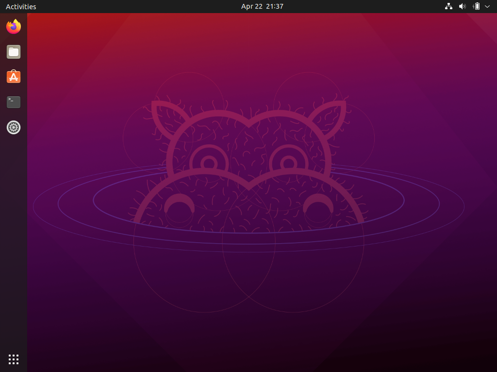
I'm a rather big fan of Ubuntu's default appearance. For every update, they change the default wallpaper to match the codename for the latest release. Ubuntu 21.04 is called "Hirsute Hippo," so we have a hippo on the wallpaper. I personally wish there was a wallpaper included which onlu featured the nice gradient effect that Ubuntu is somewhat known for, but it's overall fine by me. The dock and activities bar also look very nice, intersecting in the top left corner.
Upon opening the settings app, you may be a bit dissapointed if you're used to vast amounts of customization options.
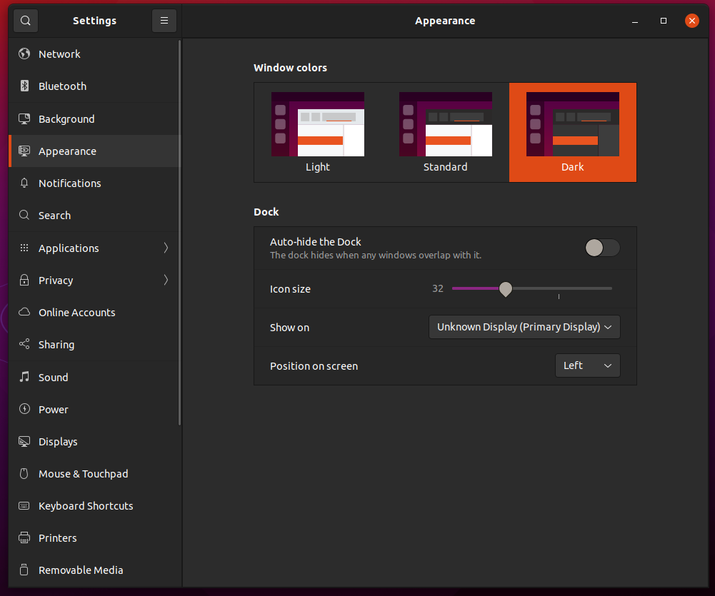
In the above screenshot, the appearance tab is shown, and there's not much there. There are only three different color schemes available, and no way to change the titlebar appearance, folder appearance, or cursor appearance. I sure hope you absolutely love the default appearance of Ubuntu, because for the most part that's all you'll be getting. This is very dissapointing, especially when compared to Linux Mint which has tons of appearance settings available. While in Mint you can pick from a wide variety of colors and icon/window themes, Ubuntu only lets you pick a dark theme, a light theme, or an in between, where some of the UI is dark and some is light. I find it rather strange that the activities bar stays dark even when in light mode, considering the window titlebars change. Upon looking through the other options, they are similarly barebones, especially compared to Linux Mint.
And here is the default file manager, Nautilus. Eugh.
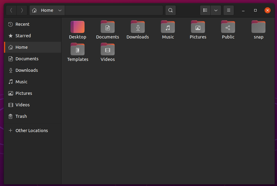
Now's probably a good time to mention a big problem I have with the GNOME desktop environment. Most GNOME apps have their own custom titlebars with buttons for things like searching, options, etc. I've always found these custom titlebars to look strange and have been pretty against them. It also means that if you want to run a GNOME app in another desktop environment, it will probably look off, while in a tiling window manager enviroment it will look extremely out of place due to there being window controls. I would consider Nautilus to be the worst offender of GNOME's custom titlebars. Nautilus just crams every option and setting into one titlebar, which just looks strange and cluttered. I did not want to use it, and therefore installed Nemo, which is the default file manager in Cinnamon.
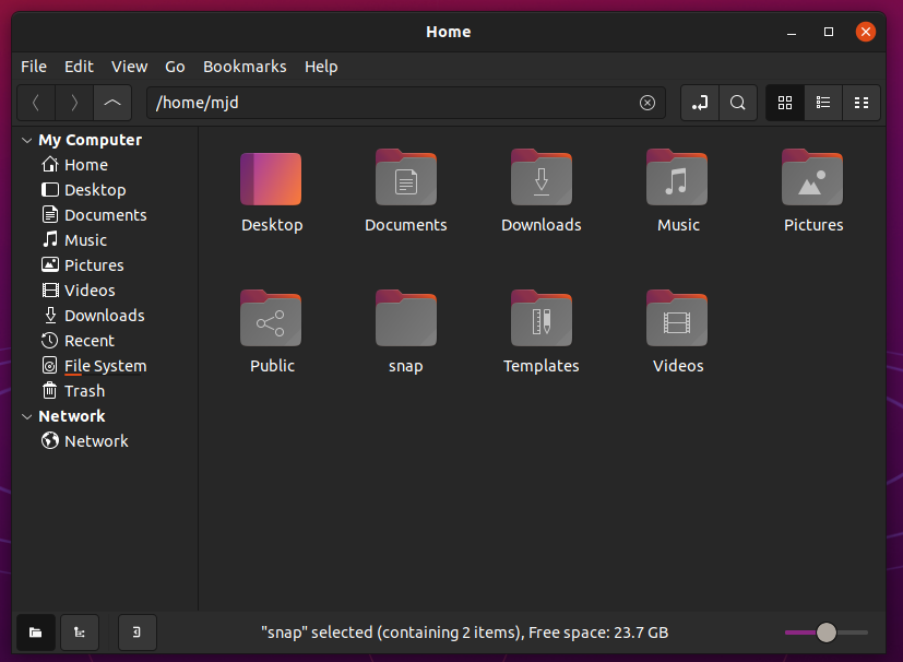
Comparing the two, Nemo looks a lot less cluttered because it doesn't try to put everything into one titlebar. Instead it uses the titlebar just to display the program name and window controls, and has seperate toolbars for seperate functions. I would personally never use Nautilus over Nemo, or most other file managers.
Ubuntu also features GNOME terminal, a simple yet effective terminal emulator. I changed the background from the default purple to grey, as I find it to look a lot better.
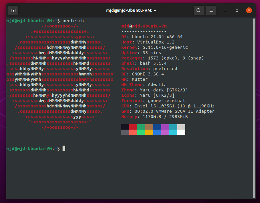
Here is the Ubuntu Software center, which is intended to make installing new programs less intimidating compared to Apt. Overall, it's completley fine and I have no big problems with it. I'd personally always rather use Apt instead of a graphical software installer, except for in some cases where I'm just browsing around for some interesting new stuff to try out, in which these software centers shine.
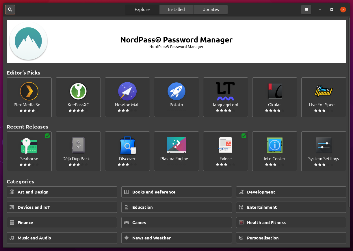
This is GNOME's app view. I'm showing it to show off how little software there is installed. This is because I picked to install Ubuntu with minimal software. There is a second page, but it does not have too much else.
I really like seeing distros having a minimal install option. It makes the install go by a lot faster, and it takes up a lot less space. Personally I don't usually go with the default software installed on most distros, as I'd rather uninstall it and install my own preferred software. However, with minimal installations like this, I have the freedom to install things like whatever media player I want instead of the defeault Ubuntu ships with. Also, the install was incredibly fast, taking around five minutes!
My final opinion on Ubuntu is rather mixed. In a void, I'd say it's pretty good, however pretty much everything Ubuntu does well, Linux Mint does better. If you want a very polished distro for an absolute noob to computing, mainline Ubuntu will do it for you. However, the lack of exciting new features really is holding it back in my eyes.